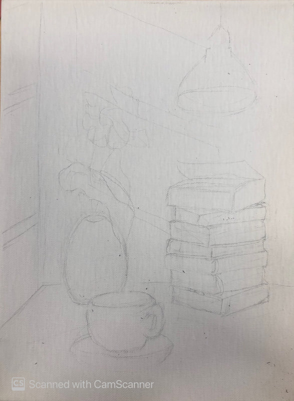
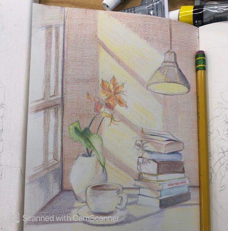
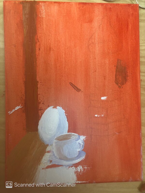
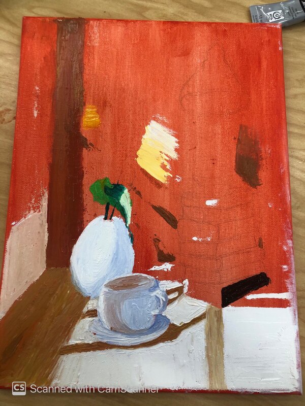
sketches and progress photos final 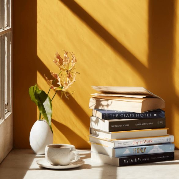 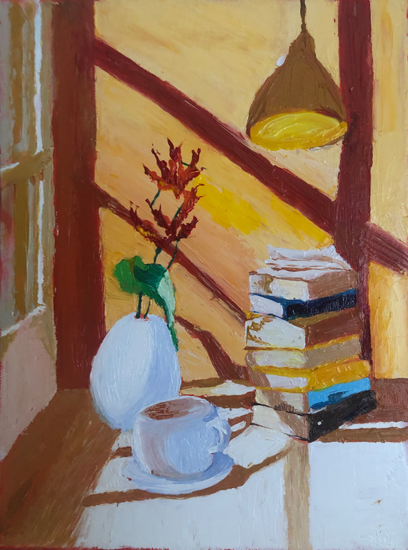 I chose to do a textured landscape with the palette knife because I wanted to try something different and I saw a lot of paintings using that technique that looked really good. I had a lot of opcions but at the end I chose this one because I liked how the sunlight entered the window and you could also see all the shadows in the pile of books and in the table. I thought it would be easy but it wasn't. I don't think I wanna paint with the palette knife anymore. It was so hard painting the little details and making the lines look straight, my hand was shaking, and I also accidentaly mixed the colors with the palette knife so I had to wait for it to dry and put more paint so it wouldn't look bad. I also didn't know what color to chose for the shadows, but at least I think it looks ok.
0 Comments
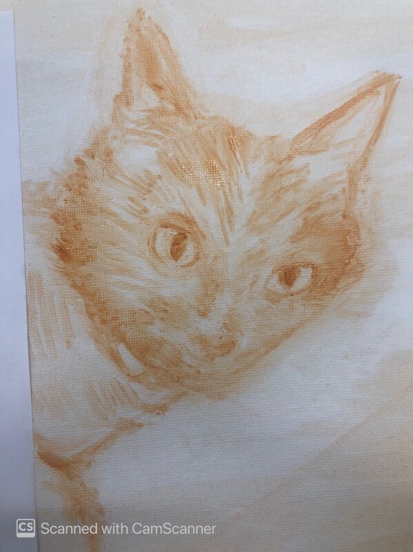
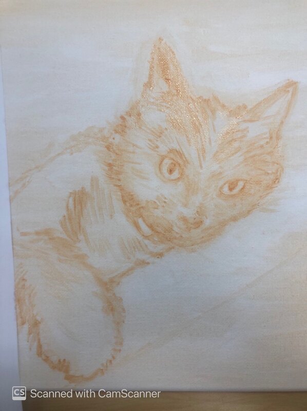
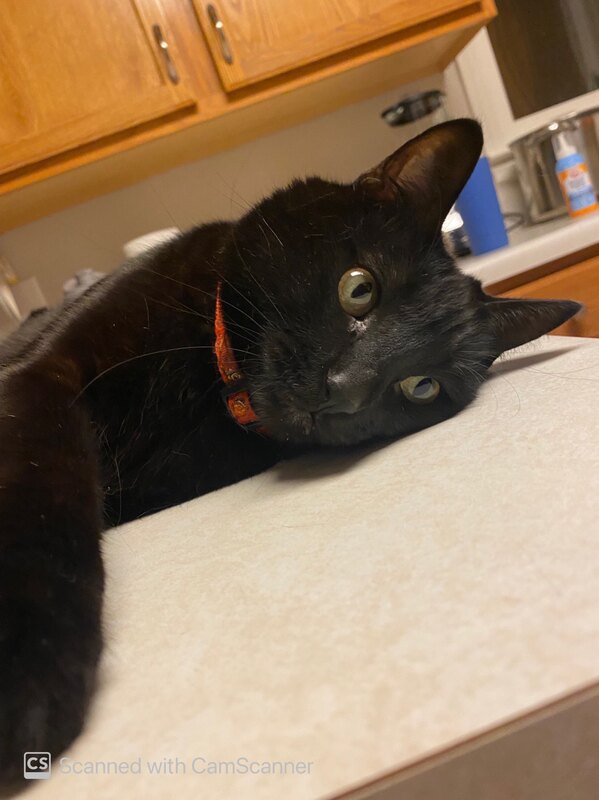
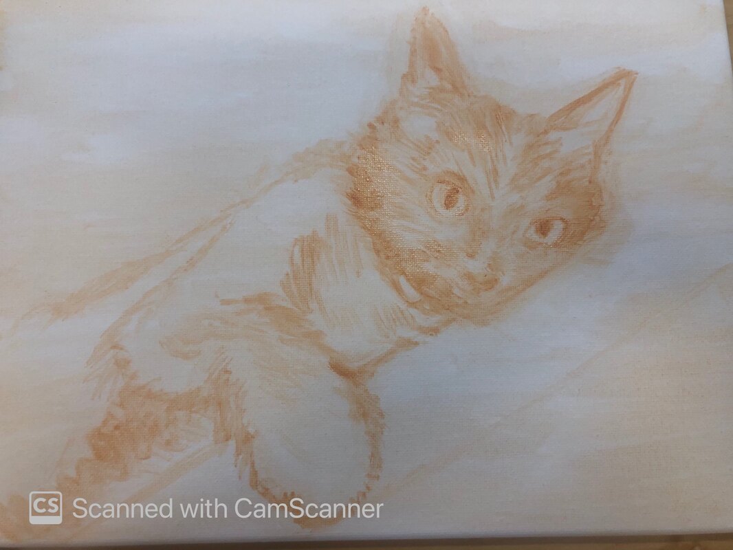
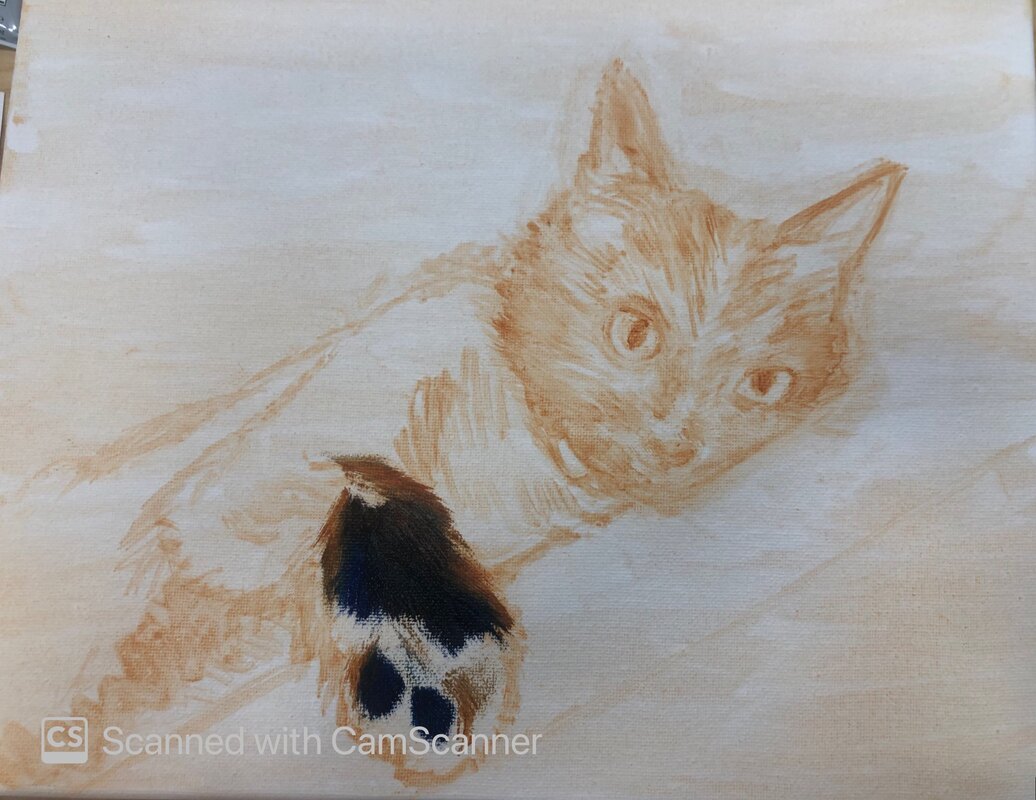
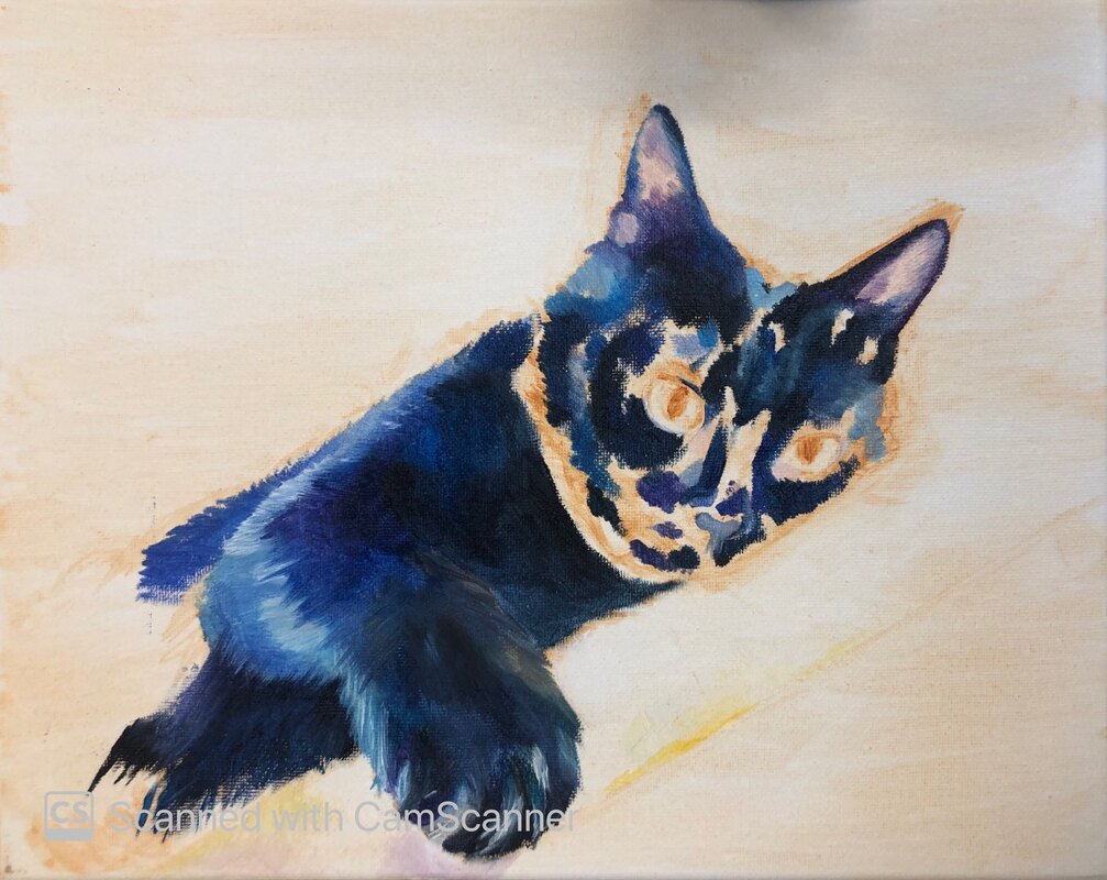
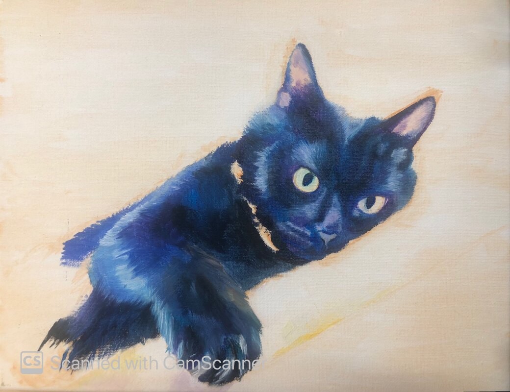
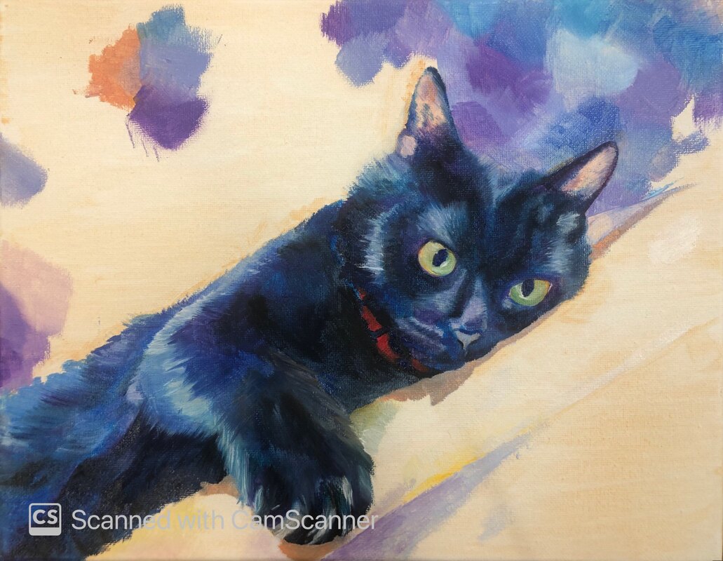
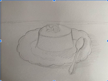
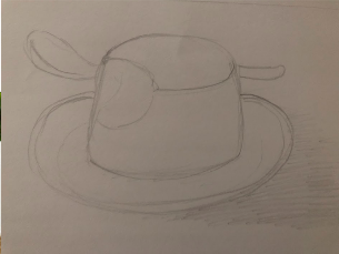
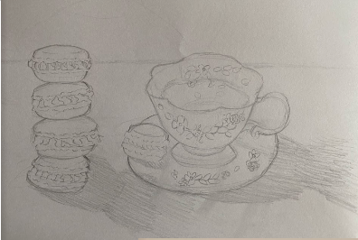
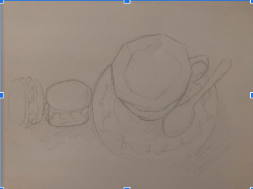
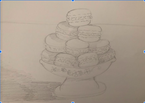
Brainstorming ideas: compositional sketches and reference photos: in progress photos final painting  self evaluation questions
My first ideas were:
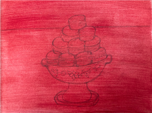
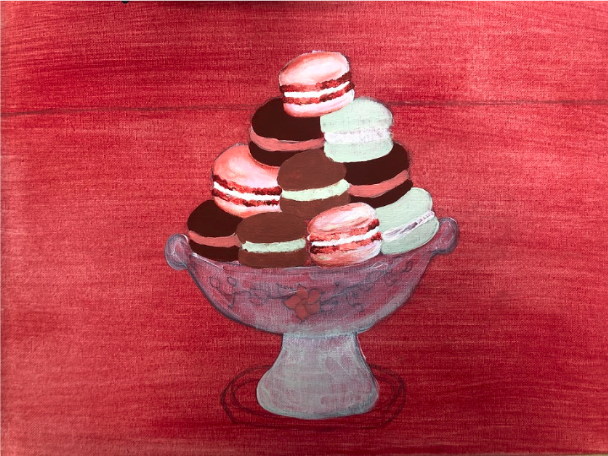
final color sketch 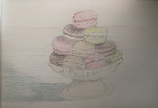 in process 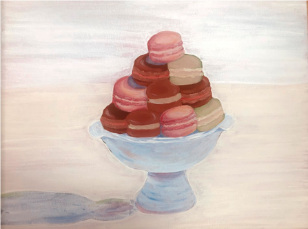 final 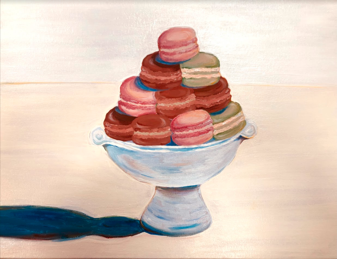 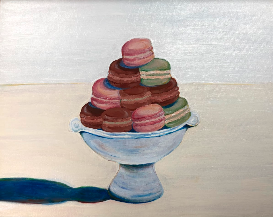 Theibaud Inspired Painting Self-Evaluation
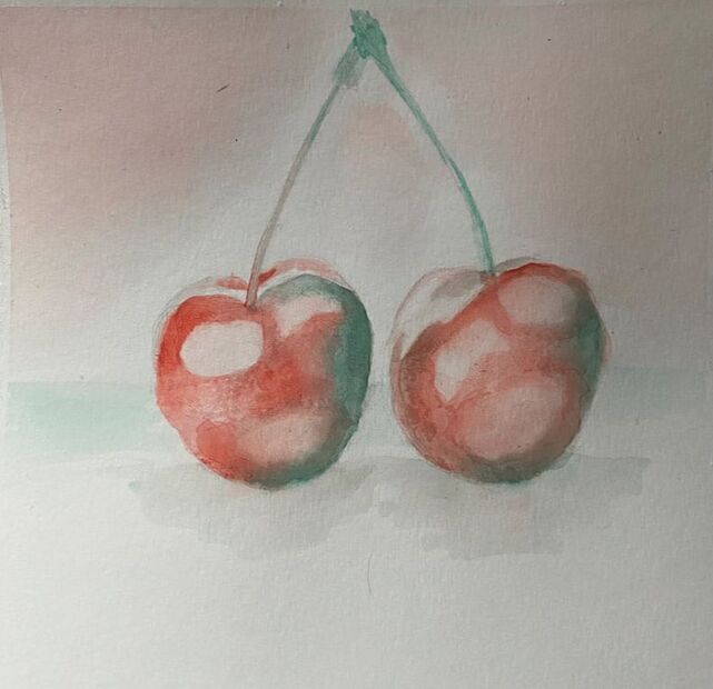
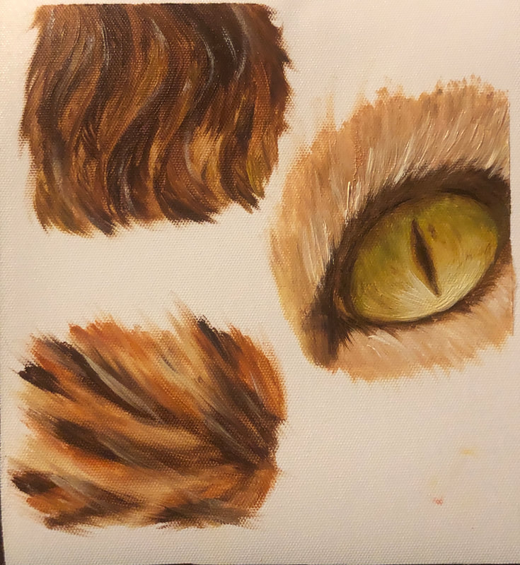
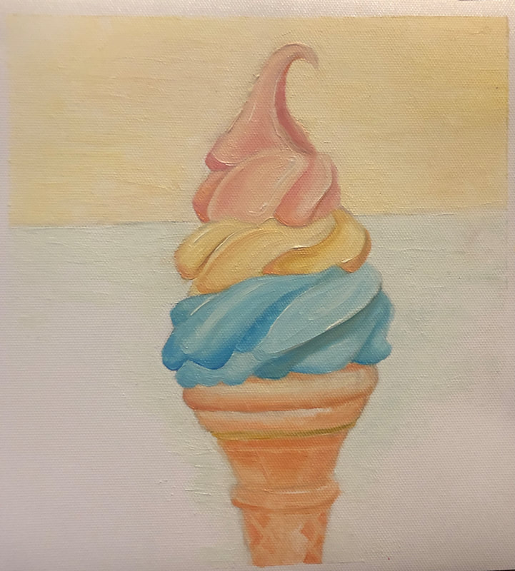
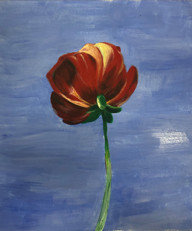
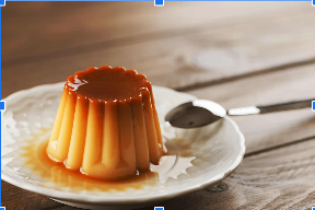
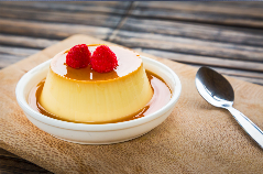
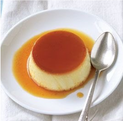
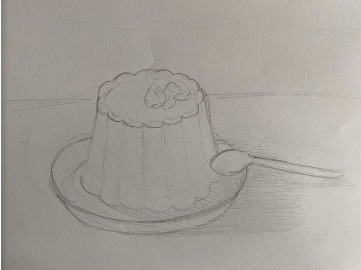
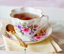
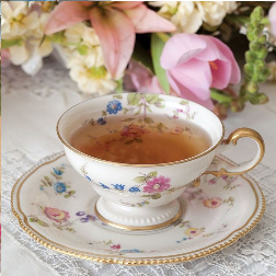
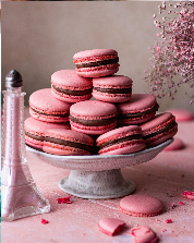
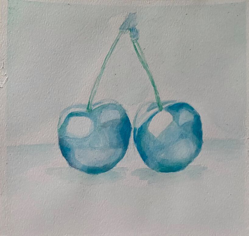
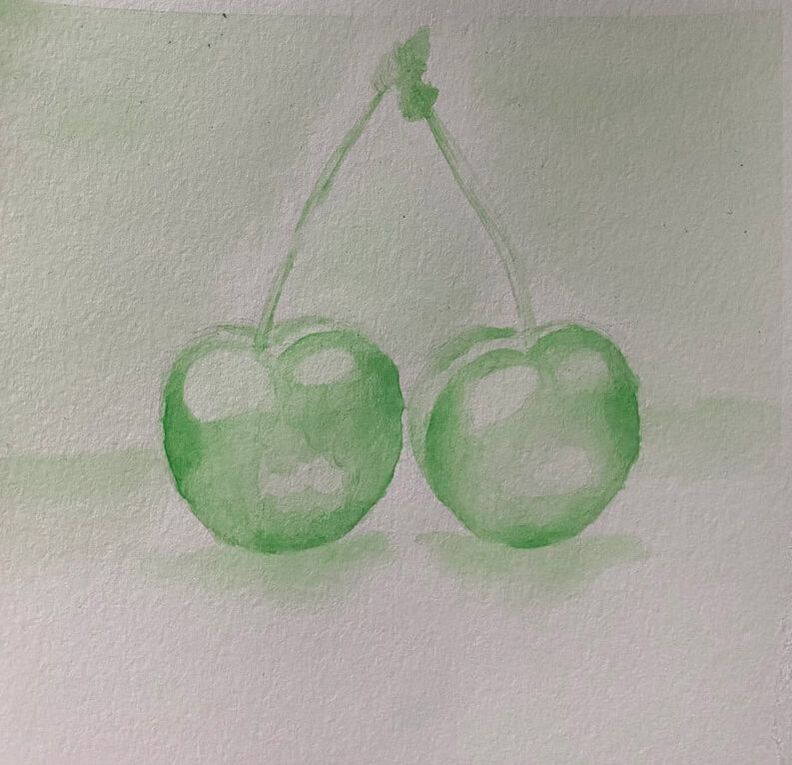
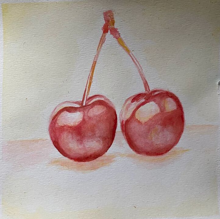
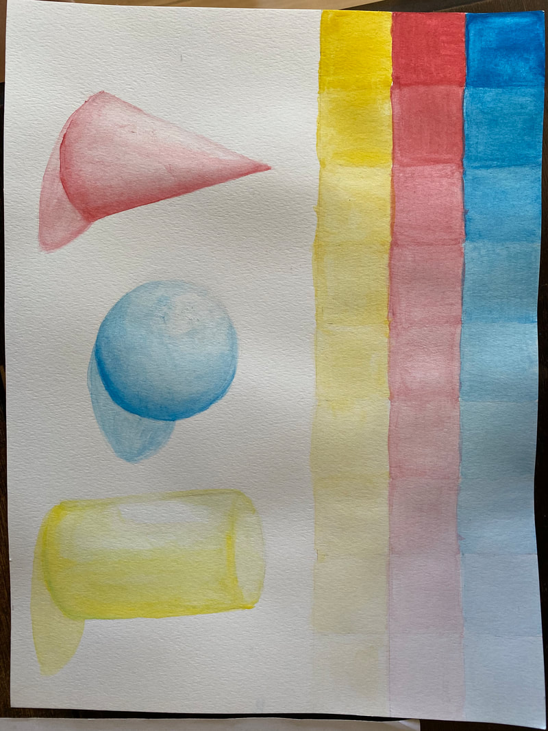
2. How does your work embody the artist’s style? I painted a dessert, using complimentary colors. also I added strong shadows that were really important. I used a lot of paint to give some texture and did a really simple background. 3. Describe your choice of colors/color harmonies and how you used them throughout the artwork. For the macarons I tried to use pastel colors with different values. I tried to use complimentary colors for the highlights and for the shadows I used mostly blue and a bit of red and green. 4. What is the emphasis (focal point) of your artwork? I think the amount of paint I used gives the macarons more texture and the shadows really stand out. 5. How did you use textures and patterns to embellish your artwork (Hundertwasser and Thiebaud (just texture))? Using different brush strokes and big amounts of paint, especially for the background 6. Describe any difficulties you had creating this artwork. It was a little difficult making the macarons look a little more realistic, but I think the most difficult was making the strong shadows so it wouldn’t look weird or too dark, also painting them in the right places. self reflection questions 1. What watercolor techniques proved to be effective in your painting? How and Why? The use of watercolor pencils for the little details in the trees and especially the wet on wet technique for the reflection in the water 2. How important was using transparent layers in your painting? It helped me choosing the right colors and it was easier to visualize how would it look after I added all the layers 3. Explain how your composition was successful? Did you utilize all the elements of art and principles of design? Explain. It was my first time using the wet on wet technique for a painting, but I think that was one of the main parts of my landscape, the reflections in the water makes it look more realistic 4. Was color choice an important factor in the overall success of the painting? Why? Yes, because it makes it look brighter and more colorful, and with a variety of colors it looks more realistic 5. Describe your craftsmanship. So I just sketched really lightly on the paper, then I added some light colors and looked which one seemed better, then I added more layers leaving some spaces in the trees and with the watercolor pencils I added some details in the boat and the trees, at the end I used the wet on wet technique for the water reflection and clouds 6. If you were able to do something different what would it be and why? maybe like the curved line between the trees and the water and add more variety of trees 7. Explain to me what you have learned about watercolor and how it has improved or discouraged your development in art. At first it was difficult because I had to be cautious with the amount of water and layers, also I had to wait fo the layers to dry before I added another one, choosing the colors, making the shadows and the highlights but I think with more practice I can improve. And I really liked painting with watercolors, it really looks pretty. final painting 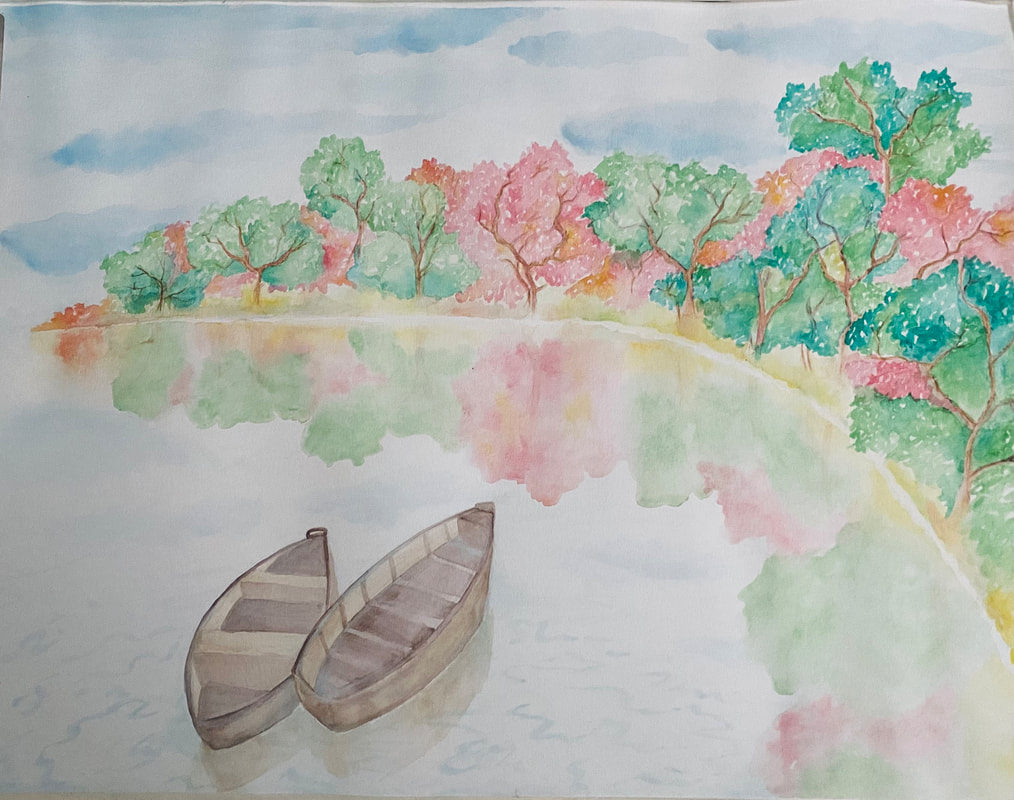 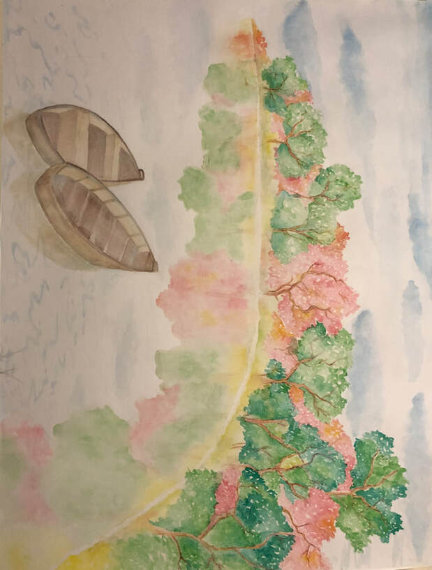 process photos 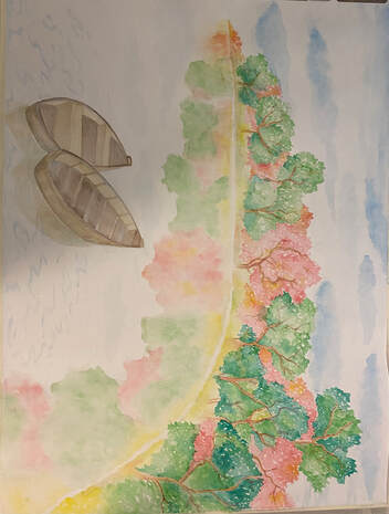 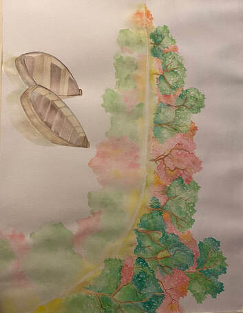 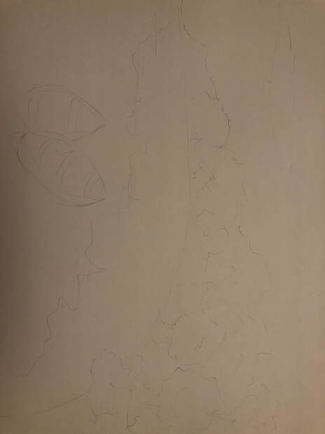 final color sketch 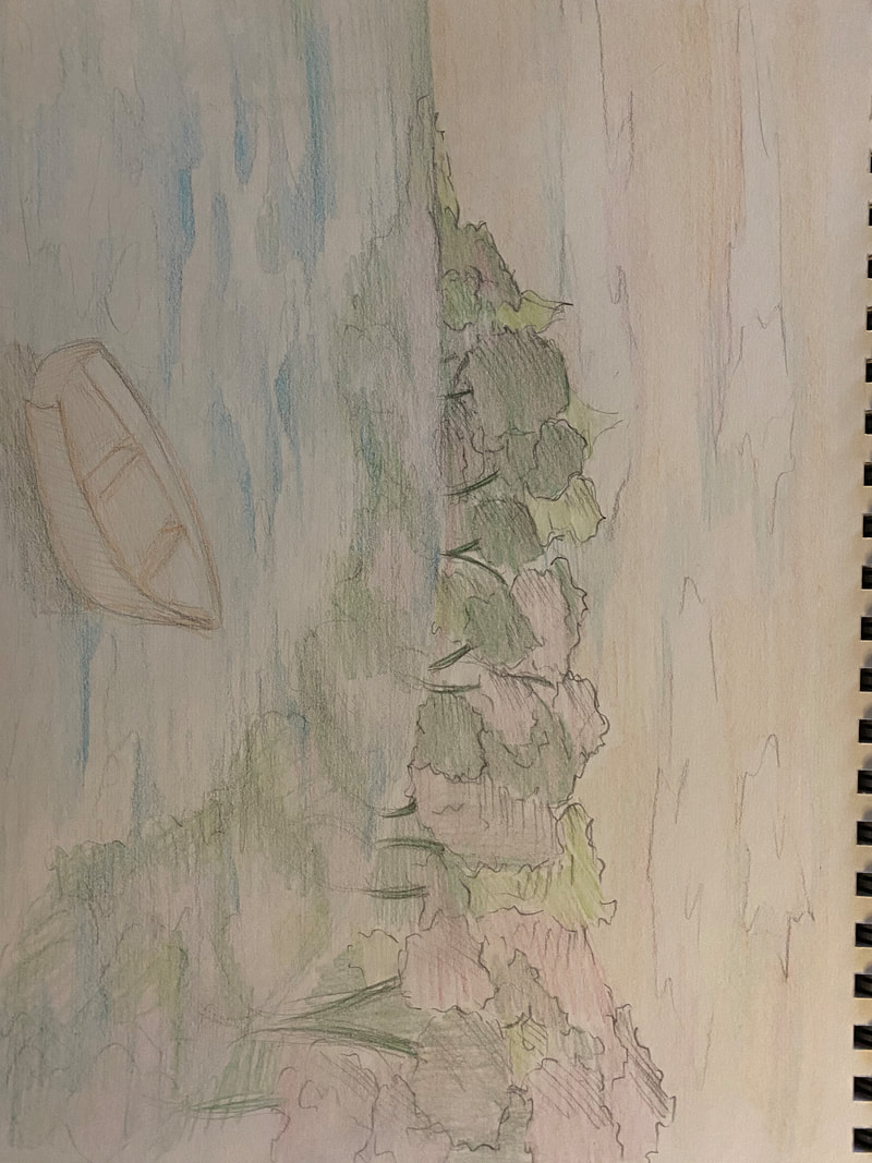 This are my references photos.  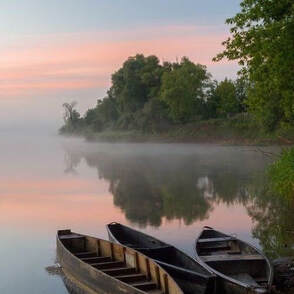 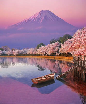 The first one I chose to do it with cool colors, the second one is with monochromatic (green), the third I used warm colors and the last one I chose complimentary colors (red and green)
 |
AuthorWrite something about yourself. No need to be fancy, just an overview. Archives
June 2021
Categories |


 RSS Feed
