final painting

Self evaluation questions
1. Describe the craftsmanship of your painting. (Is it neat and well-executed, edges finished, clear and well done?)
I would say it’s neat without any white space left and with all the edges finished.
2. How does your work use the Elements of Art ( Line, shape, color, value, form texture, space)?
For the body part of the bird I actually used different layers with different values of blue, making some parts brighter than others and adding the dark parts first.
3. Describe your choice of subject matter, why did you choose this animal and what is the painting saying about the subject?
Last year I painted my cat and I saw that almost everyone was going for a dog/ cat, so when Ms. Rossi said I could try painting feathers. I just searched random photos of birds until I saw one that I liked.
4. What is the Emphasis (focal point) of your artwork? How did you accomplish this?
Maybe the texture for the body of the bird, because of all the values of blue you can see and in some parts I added a little of pink just so it wouldn’t look completely blue.
5. Describe how and where you used Texture to enhance your artwork?
I added texture for the feathers/ body of the bird. I just layered some colors beginning with the darkest ones and leaving space for the lighter ones.
6. How did your animal research impact how you planned for your painting? What other steps did you take in the planning process to make a successful painting? Is your final painting successful? How?
I actually was going to do something more realistic but it was getting complicated and we just had some days left so I just added little painstrokes really randomly throughout the bird’s body until I found a patron and it was looking good so I finished painting it all that way.
7. Describe your experience using the oil paint medium. Compare it to other paint mediums you have worked with so far this semester.
I feel it was really important to clean the brush so the colors wouldn't mix in it. Also taking my time so I don't over blend and choose the right colors in the sketch. I really liked painting with colors, I feel that it’s better using them for painting more realistic art compared to the acrylics and sometimes it’s really good that the colors take a little longer to dry so I can continue using them for some days.
8. Describe any difficulties you had creating this artwork. Are there any changes you would make?
The only difficulty would be that when I did the overpainting some parts of the body were wrongly positioned and I had to wait for the paint to dry so I could fix it. I really liked the colors I ended up using for the background^^ I feel it’s one of my favorite paintings I’ve made.
progress photos


compositional sketches |
reference photos |


brainstorming ideas


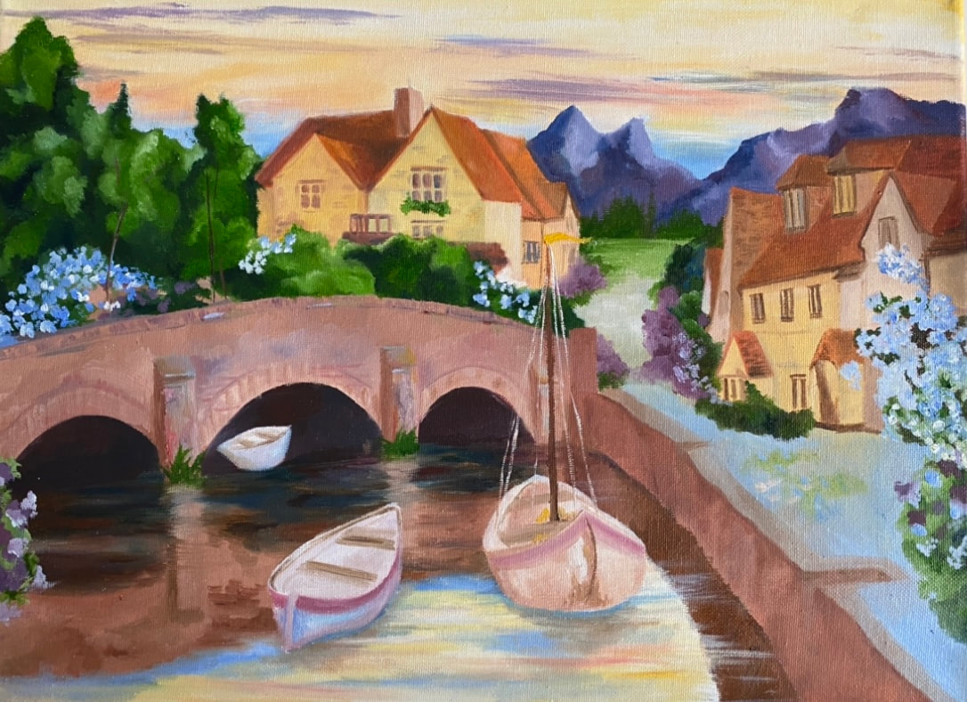
final landscape painting
Self evaluation questions
1. Describe the craftsmanship of your painting. (Is it neat and well executed?)
I feel it looks ok and I tried not to leave any white space.
2. Describe your choice of colors/color harmonies and how you used them throughout the artwork.
I wanted the landscape to look like a warm atmosphere so the sky wouldn’t just be completely blue and white. Also I decided not to go with cool colors for the little houses, that’s why some look like orange-yellow.
3. How did you create contrast in your painting?
I used many values of green for the trees in the background so it would look like a forest next to the houses. I also remember adding a lot of colors (it was really random) to the bridge because I just wanted it to have some texture.
4. How did you apply textures, highlights and shadows to enhance your artwork?
It really helps with adding depth to the painting and making it a little more realistic. I added shadows in some of the structures and specially in some parts of the bridge touching the water and the trees in the background.
5. How were you able to create depth in your painting?
Adding darker values to some parts of the painting and recreating some colors of the structure in the landscape to paint the water.
6. What painting techniques did you use that made your painting successful?
I’m not sure if it’s a technique but when I was painting the reflection, I tried to finish it before it completely dried and make the structure as if it was blurry; not following the original shape.
7. Describe any difficulties you had creating your drawing and what you could do to improve your drawing?
The sky. I’m still not so sure about it because I feel it’s too yellow. I had some difficulties with the reflection of that part in the water.
The perspective I think it’s a little off because of the houses on the right side, I’ll have to improve on that.
8. Explain the successes you had with this painting.
I feel like I got the texture I wanted to add for the bridge, so I’m happy with that. Also it was my first time painting trees/ reflections in the water with oil paint and it doesn’t look that bad.
progress photos


reference photos |
compositional sketches |
|
|
|


brainstorming ideas


Oil Paint Practice |
100 Square challenge oil |

|

|
Hundertwasser Final Painting

Progress photos


reference photos |
compositional sketches |
final color sketch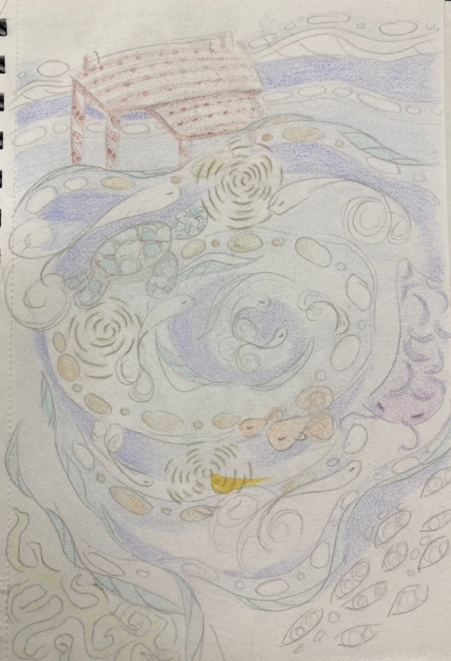
|


brainstorming ideas
- Garden of flowers
- Room with a lot of stuff
- Person under the rain
- Landscape with a little house
- Library with flowers
- Person taking a photo with a landscape in the background
- Night landscape
- Underwater landscape (with fish and nature)
- A street in night
- Divide it in two (day and night)
self reflection questions
1. Describe the craftsmanship of your painting. (Is it neat and well executed?)
I used different values of blue for the ocean so it would look like different layers and with a little more depth. Also I tried to paint different patterns in some parts of the water, the fish and some spirals that seemed like lights and reflections in the water.
2. How does your work embody the artist’s style?
Hundertwasser used a lot of patterns and different colors in his paintings so it would look really bright and interesting. I tried to make some resemblance with the patterns and the way I choose to paint the water with a spiral in the center.
3. Describe your choice of colors/color harmonies and how you used them throughout the artwork.
In the upper part of the painting I added different values of blue trying not to go too dark in that zone so it would be like the surface of the sea. It went darker in the lower part and added different fish and plants so it would look more like an under ocean view. For the highlights, there's some parts with yellow that resemble some lights reflected in the water.
4. What is the emphasis (focal point) of your artwork?
Definitely it would be the spiral that goes to the center. Maybe the different colors and spirals around it too.
5. How did you use textures and patterns to embellish your artwork?
I used different patterns with different colors in some parts of the water, especially the darker ones. Some patterns in the fish and plants at the bottom of the ocean. Also the little spirals and patterns around the fish.
6. How did you put a border/spiral on your artwork? How does it enhance the work ?
I used a big spiral for the background so the water and fish would look like they move around it.
7. Describe any difficulties you had creating this artwork.
Mixing the colors. Sometimes when I needed a certain blue, I forgot how I mixed it or I just couldn’t get the right blue. Also sometimes I had a difficult time figuring out which blue would go good for the spiral. The dark blue was really transparent so I had to go over it many times.
8. Explain your successes and the importance of planning and revising sketches to achieve desired outcome.
I think making the sketch first is really important. It gives you an idea of how you really want it to look like. It also helps to see which colors would look good, so you won't have to worry about it while painting. It's also good to use it as a reference.
9. How can you use what you learned from this painting to enhance your future paintings?
To choose the colors I really want to use and look good in my sketch so I wont change it later. Also make the sketch a little more detailed and have patience while painting with transparent colors. Using patterns was fun too.
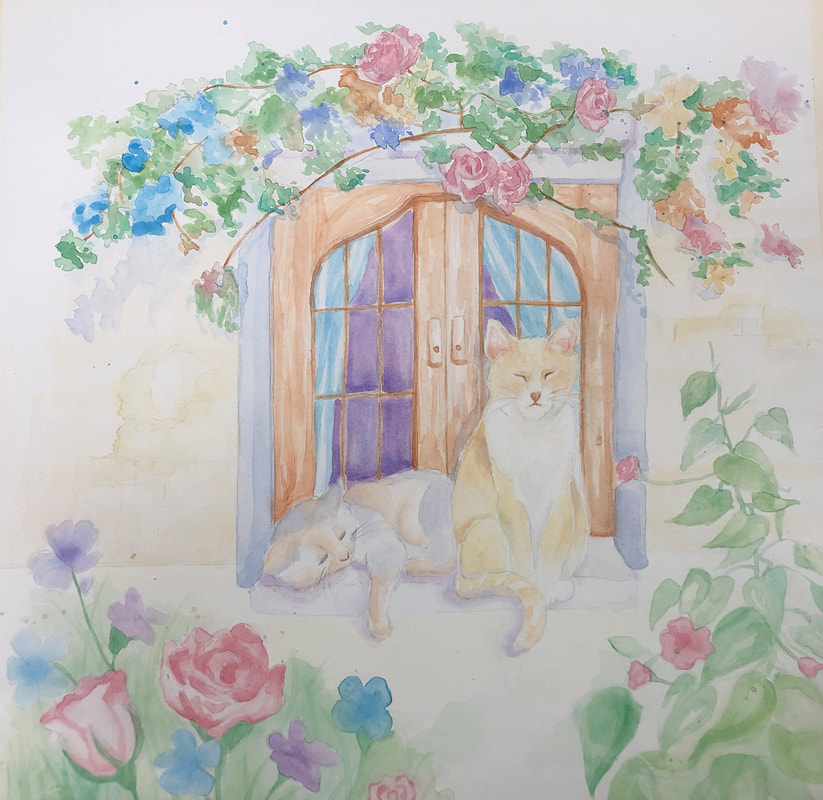
watercolor landscape- final painting
compositional sketchesreference photos |
final color sketch
Progress photos |


self reflection questions
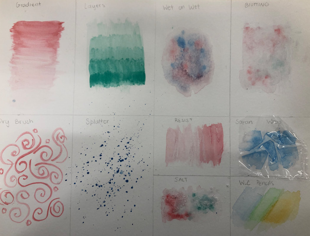
1. What watercolor techniques proved to be effective in your painting? How and Why?
I used gradient and layers especially in the leaves and a little in the background. I also used the colored pencils for small details in the window and the cat's faces. At the end I used the splatter technique for the flowers.
2. How important was using transparent layers in your painting? It was useful to see how darker I wanted to go and also to check which colors I could add to make it look good. Also to decide where I should add the shadows.
3. Explain how your composition was successful? Did you utilize all the elements of art and principles of design? Explain.
I think using light layers helped me a lot and at the end I just decided which parts I wanted to make it look darker. Also the wet on wet technique in some of the flowers and background was really useful.
4. Was color choice an important factor in the overall success of the painting? Why?
Absolutely, It helped me choose the right colors so it would look brighter and that the shadows wouldn't look too dark.
5. Describe your craftsmanship.
I began with really light layers so the background wouldn’t look too white. Then I just added the details and more layers especially to the curtains and the background of the window. I left the space of the ctas for the very end and added some shadows to the flowers and the cats. I also used the water color pencils for really small details.
6. If you were able to do something different what would it be and why?
Maybe it would be the background and make it a little more detailed or just change the color. I feel like it still looks too white. Also the details in some flowers and the shadows.
7. Explain to me what you have learned about watercolor and how it has improved or discouraged your development in art.
I need to be careful with the amount of water, also it helps a lot using lighter layers instead of going dark all at once. I should begin painting the background so it won’t look too white and I should practice painting the shadows.
watercolor fruits


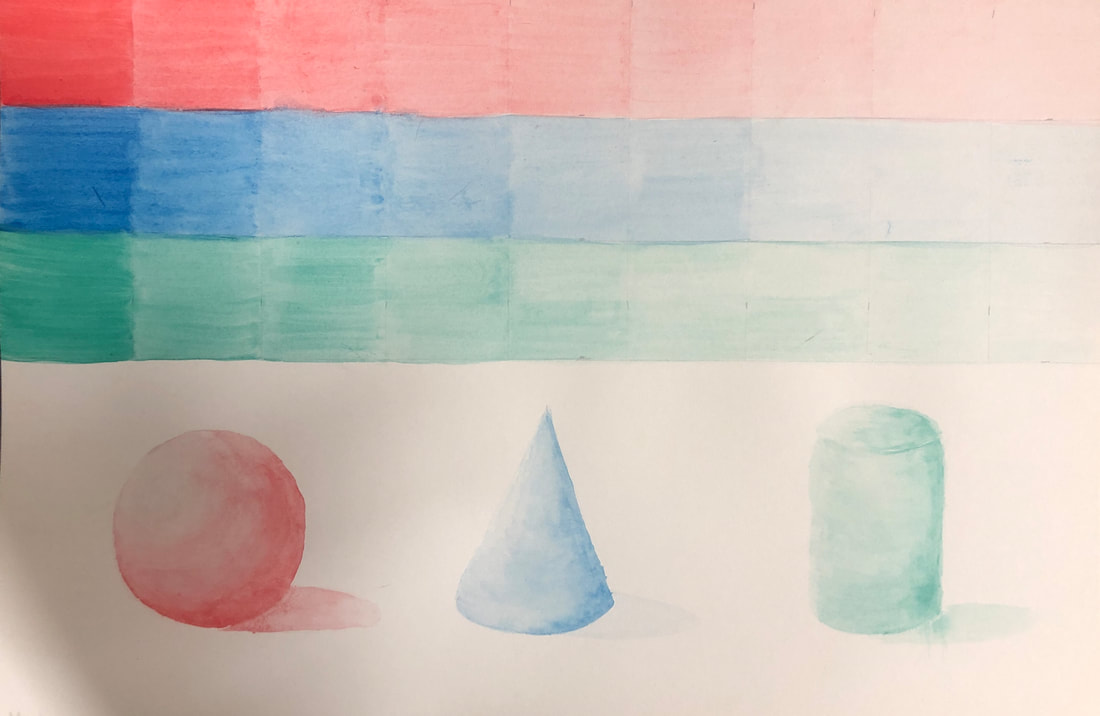
Watercolor value chart and forms
watercolor techniques
colored pencil fruit

Colored pencil forms


4 assessment drawings
portrait

foot

alien

buildings

